During my Bachelor’s in Psychology with a focus on Human-Computer Interaction, I took part in a course on UX design for complex systems. This project, completed with my team, aimed at enhancing the existing student portal.
We were aware that, as students ourselves, it might be challenging to set aside our own preconceptions and ideas about the ideal functionality and appearance of such a product.
Summery
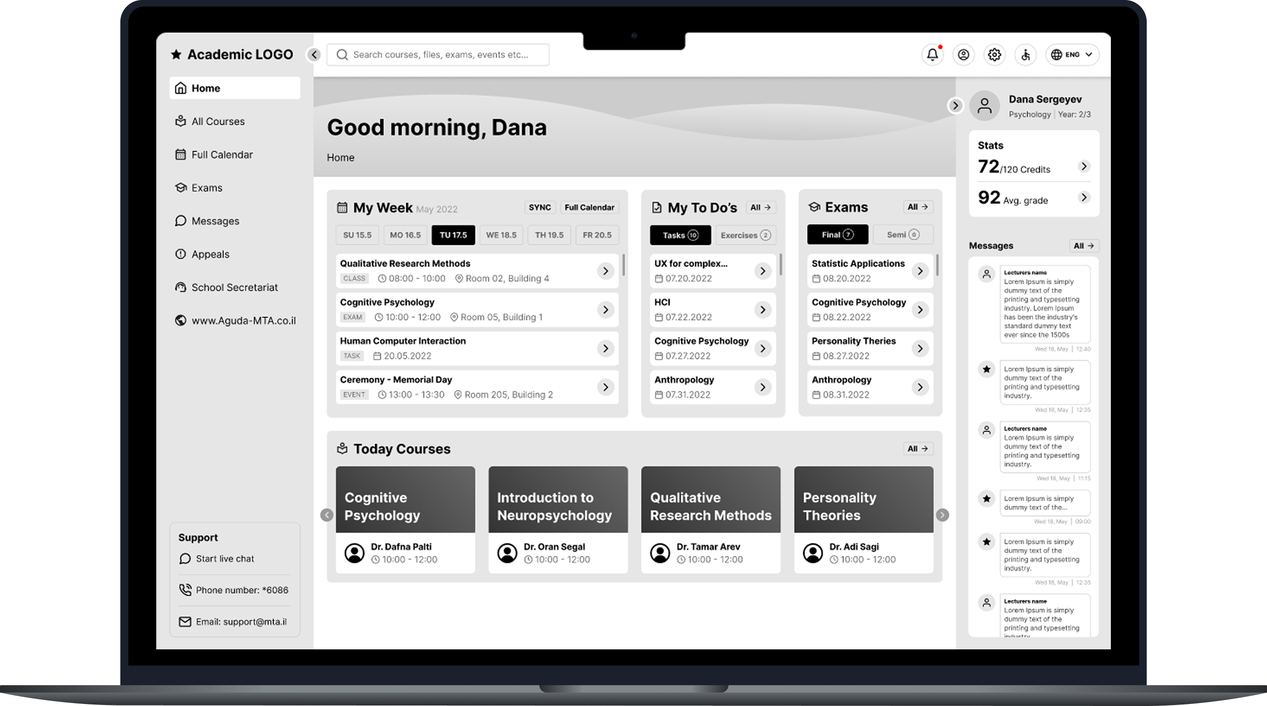
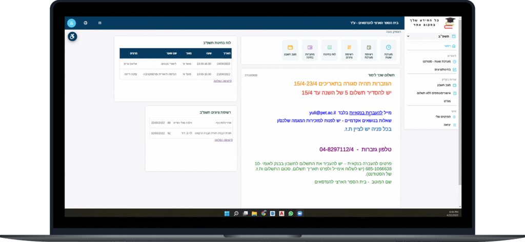
Me and my team redesigned the LMS (Learning Management System) of our academic institution to make it convenient and understandable system, that mediates between the student and the services of the educational institution.
Designed as one hub where student needs come first.
Creating a convenient and understandable system that mediates between the student and the services of the educational institution.
The Task
Making information, tasks, and assignments easily accessible to the student.
System Goals
Main Objective
Integrate existing college systems so the students can perform actions and receive information in a fast and accessible way.
Secondary Objectives
Improving the user satisfaction survey score.
Reducing unnecessary communication with technical support.
Increasing the percentage of system logins.
Reducing performing actions time.
Reducing user error percentage in the system.
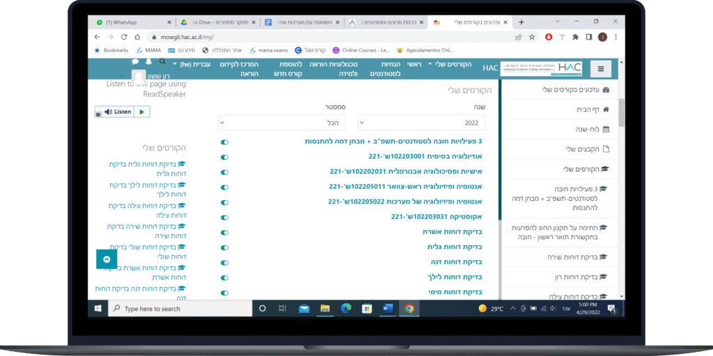
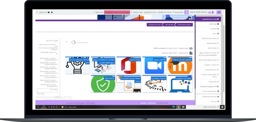
Competitors Analysis
Pros
Simple and intuitive system navigation.
Accessible lecturers contact information.
Calendar with relevant and contextual information.
Accessible files per class and time.
Cons
Irrelevant info & actions located in key system locations.
Irrelevant info & actions for different type of users (student / lecturer)
Bad use of UI and layout.
Hadasa Student Portal
Academic Ramat Gan Student Portal
National Engineering Student Portal
Product Added Value
Simplicity
Provide ease of use for the users, by the salience of main features, without confusion.
Efficiency
Lowering the number of support applications, and therefore it’s institute’s resources.
Certainty
Provide certainty for the user's actions through a holistic and consistent experience throughout the system.
Key Success Factors
Reduce lecturer’s information search time to 1.5 minutes.
Reduce download a presentation / document time below 1.5 minutes.
Reduce works and exercises submission time below 2 minutes.
Raising the average system satisfaction above 4.
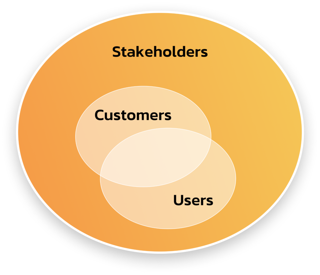
Stakeholders
Potential users
Students
Lecturers
Technical support teams
Customers
Universities & colleges
General stakeholders
The founding team (us)
User Research
Research Methods
In the ‘Strategize’ phase in order to get inspire, explore and choose directions and opportunities, we committed the followingqualitative and quantitative methods:
Users feedback
Self reported, open-ended and close-ended information provided by a sample of users (students) through an online questionnaire.
Interviews
A researcher conduct interviews with potential users (students and lecturers), to discuss in depth what the participant thinks about the topic in question.
Requirements
Information
Dates of submission of works
Daily calendar
Test and exams dates
Messages from lecturer
Tests from previous years
Actions
Works and exercises submission
Download & viewing presentations
Ordering documents & certificates
Courses registration
Payment of tuition
User Interviews
From the user interviews we conducted, here are the most profounding quets we got about the current situation of the user’s frustration:
I realized that this is the given system
and I need to accept it, there isn’t any other option.
I felt frustrated, if I understood what is written on a button - I would not be wasting time.
It's disappointing, you invest a lot of money in tuition and you accept a reasonable system to work with.
I felt I had to fight to be able to grab the courses I needed.
I'll be more patient next time,
I do not know if there will be a change.
User Persona
Basic Info
Age: 20 – 40 Education: During the degree Marital Status: All Location: All Languages: Hebrew, English, Arabic
Work environment
Using the system is possible from anywhere with an internet connection, on campus or at home, accessible both via desktop and smartphone.
Goals in the system & Motivation Level
Receive information: course and assignment calendar, exam dates, lecturer’s messages, previous year’s exams.
Take actions: submitting assignments & exercises, downloading & viewing presentations, ordering documents, course registration and paying tuition.
Pain points
Lecturer’s contact details, set reception hours sync academic calendar, course registration, home screen personalization, submissions dates, tests from previous years, course syllabus.
Task Analysis
How did our research translated into the design?
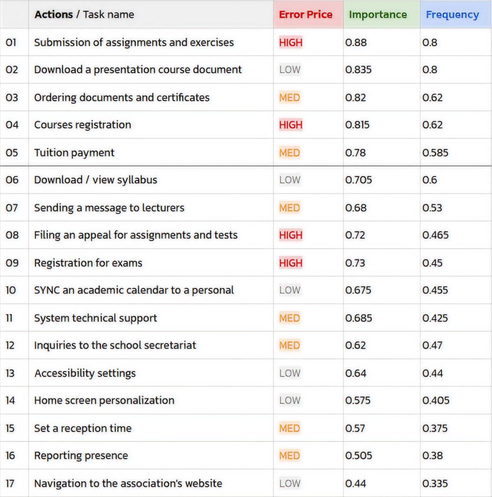
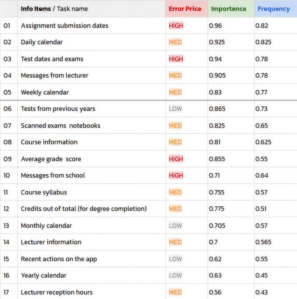
The questionnaire we built consists mainly of questions about two categories: Actions and information details, and in each category, there were 17 items.
For example, under the category “Actions” there is the item “Sending a message to a lecturer”. On each item, participants were asked to rate according to two categories: importance and frequency.
From 1 (very low importance) to 4 (very high importance), and from 1 (very low frequency) to 4 (very high frequency).
From the results we received – we could see how many people (N) marked the score 1, 2, etc.
To get an exact result of which item is more important / more frequent, we compiled a formula with a wider scale of 200 (we took the number of participants N = 50 dual the scale of 4) so that each result shows exactly the numerical value of the item.
Example item – My average score:
Information item
According to its frequency: 15 people marked 1, 17 people marked 2, 11 people marked 3 and 7 people marked 4.
According to the formula we composed: = [SUM (C21 * 4, E21 * 3, G21 * 2, I21 * 1)] / 200 = ((15 * 1) + (17 * 2) + (11 * 3) + (7 * 4)) /200 = 0.5 – Its the value of the average score frequency.
Making information, tasks, and assignments easily accessible to the student.
Development Requirements
Phase 01
Platform: Web app (Desktop first, mobile, tablet).
Resolution (minimal): 1366×768 (based on statcounter).
Phase 02 (out of scope)
Responsive design: designed for devices with different screen sizes, automatically adjust the content layout to the available screen size.
Browsers: Chrome, Safari, Explorer, Firefox.
Design System: primeng with adjustments.
Concepts
Concept 1
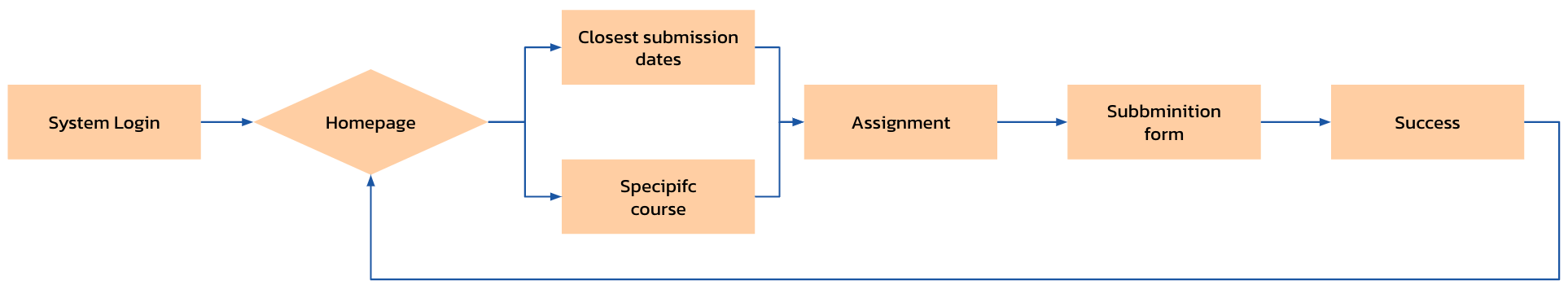
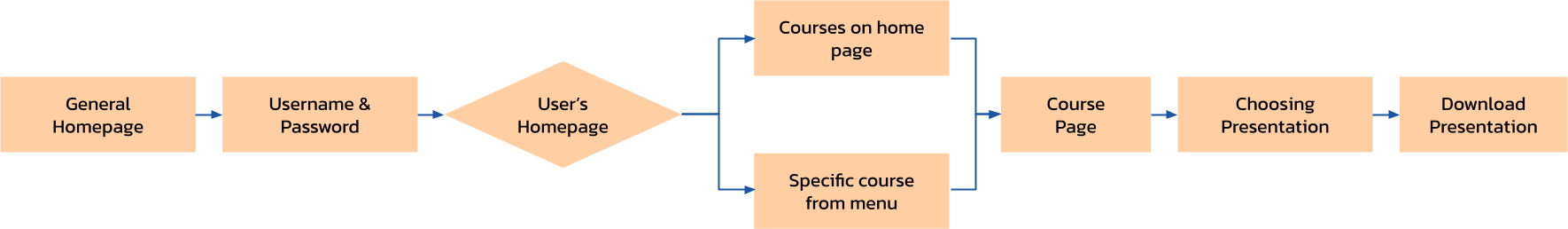
Action Flow
Submission of assignments and exercises.
References
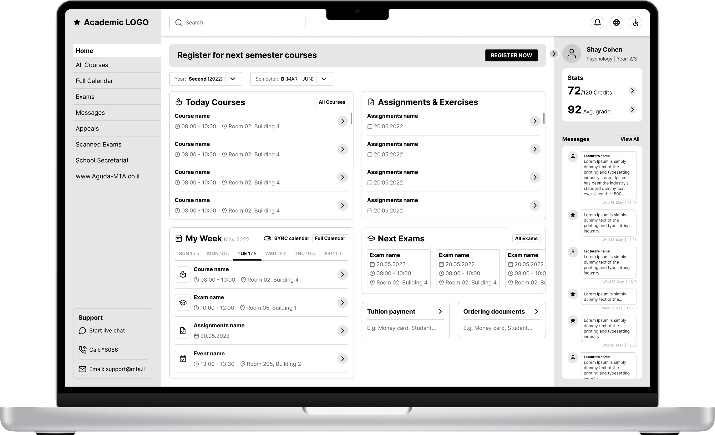
Clean ,flat, modern dashboard UI.
Clear hierarchy, personal (student) area.
Simple, easy to scan and understandable layout.
System search bar, accessible support.
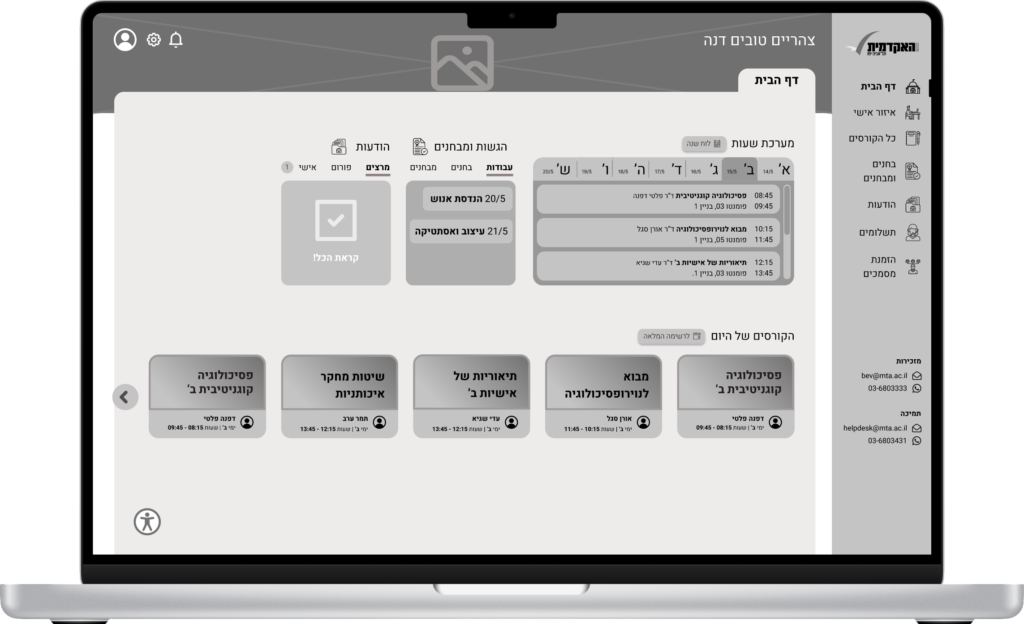
Wireframe – Concept 01
Concept 2
Action Flow
Submission of assignments and exercises.
References
College of Management Academic
Course Selection:
Each course displayed presenting it’s vital info.
Hierarchy of information is logical and intuitive.
Hadassah Academic College
Course Page:
Courses layout was clear and efficient.
Consistent content throughout courses.
Wireframe – Concept 02
Conclusions
Final concept – Detailed Design
Open Questions
Out-of-scope questions in the current process that require further consideration:
Convert the final design to mobile & tablet.
Create full user fellows for all the actions in the system.
Define further KPI’s for more features.
A-B testings for main screens and features.
Create a system for a lecturer profile.
Present and collect feedback from more stakeholders .
Main Dilemmas
Methodological Approaches and Research dilemmas:
The quantitative questionnaire we published to our participants contained plenty of specific information we wanted to gather, and that could have led to form abandonment. To prevent that, we decided that all questions about the user experience are to be scaled from 1 to 4 (instead of open ended questions) to in order to prevent burnouts.
The scaling wasn’t accidental. We decided to analyze our finding through an even scale based on methodological research methods, due to the fact that odd scale can lead to ambiguous results when participants are filling the ‘middle’ answer. Put it simply, we allowed our participants to choose an answer that leans towards one end.
On the qualitative research, when we started the competitor’s research so we can understand what student systems are on the market, we didn’t had enough knowledge about the system’s backend, and this gap led us to conduct a qualitative research with our campuses online support team, to discover and research ‘Moodle’ system, which led us to the finding that it is used by all of the universities in Israel.
Design and UCD dilemmas
When we designed our final concepts, we had to decide how to present the courses that are taking place on the same day within the homepage screen. We thought maybe we could present different picture for each course to differentiate between them, but after some research we decided to apply the ‘Aesthetic and minimalist design’ heuristic and have each presented with its title and a unique color gradient.
An issue that was brought forward at the peer review was high cognitive load – too much details. We wanted to reduce cognitive load when viewing the homepage, and therefore we allowed users to see which tasks, exams and other to-do’s they have by adding a small indication number at the title. this principle is based on ‘Visibility of System Status’ – the user knows at a moment glace what else he needs to accomplish, without being overwhelmed by information.
Not only was this project great, but the teamwork behind it was excellent! This is an excellent interface. I wish it was widely available!
Trends
Integration with Google Trends, while defining sport and field filters, thus supporting data-based brainstorming, thereby preventing abandonment to other tools.